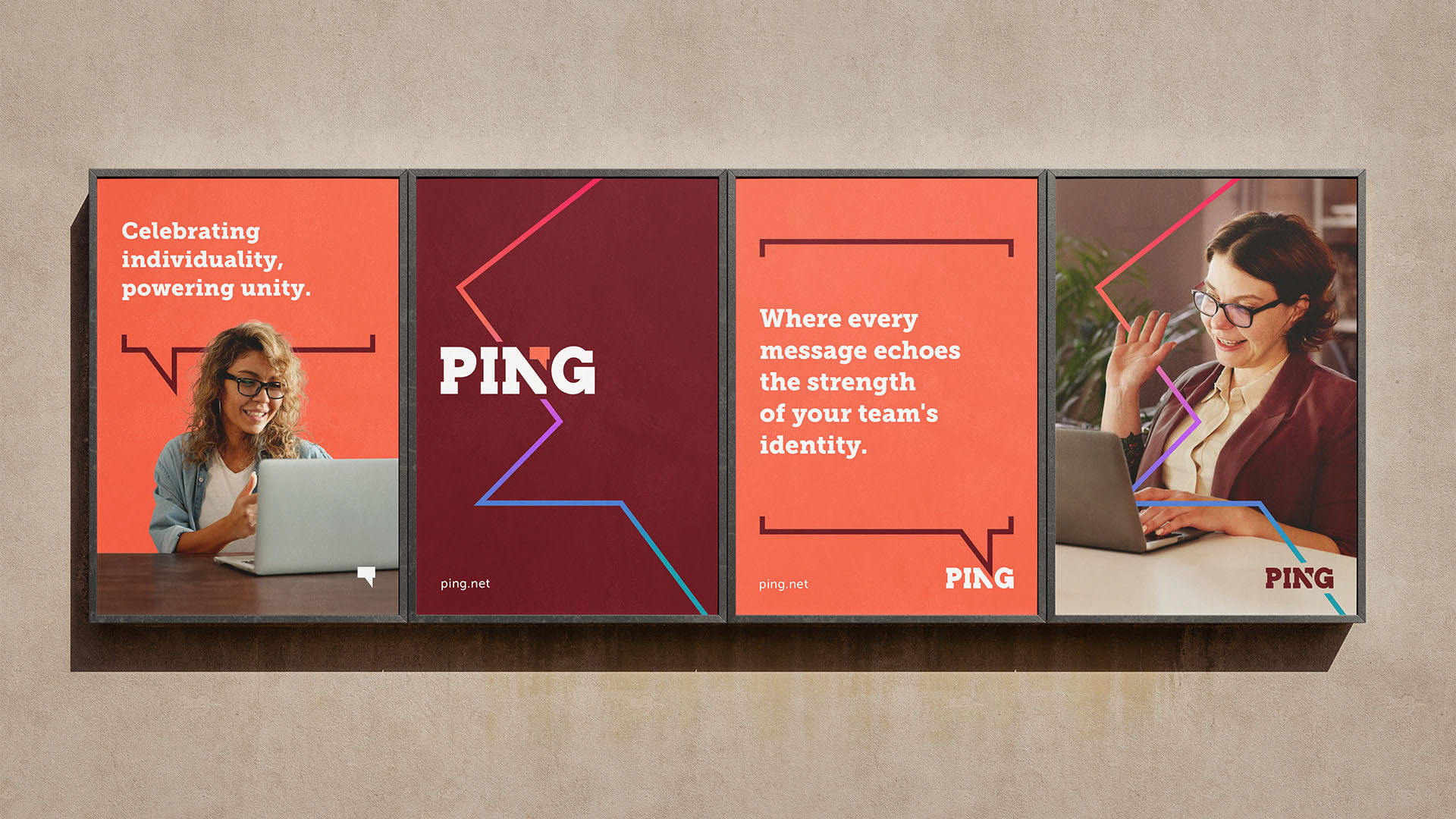

In the competitive landscape of communication platforms dominated by giants like Slack and Skype, Ping, a burgeoning fictional chat platform, faced the challenge of establishing a distinct identity. The focus was on celebrating the unique voices within each team, with a specific request for a text-based logo, optional icons, and a preferably avoidance of cliché blues for the technology sector.
In crafting Ping's brand identity as a creative exercise, my goal was to celebrate team individuality. The selected slab serif fonts exude confidence, individuality, and creative thought through their bold lines and less delicate serifs. The primary brand color, burgundy, rejects the status quo, providing Ping with a unique edge. Complemented by the vibrant accent color orange, symbolizing adventure, ambition, creativity, and sociability – qualities often associated with positivity. The result is a design that boldly positions Ping as the conversation where team strength shines.
In addition, I also designed a retailer gift box, showcasing four smaller, colorful cookie boxes. Each box boasts its own distinct color, seamlessly harmonizing with Ping's vibrant brand palette. So that, beyond its aesthetic appeal, the packaging also offers a delightful experience for recipients upon opening. The integration of Ping's brand elements ensures a consistent and memorable brand presence, making it an ideal complement to the platform's bold identity.
This logo is featured in ‘LogoLounge 13: The World's Premier Logo Showcase’
The 13th edition of the bestselling LogoLounge book series featuring the latest and greatest of identity design created by highly accomplished and noteworthy designers from all around the world. Carefully curated by an expert panel made up of some of the most revered names in the industry.