Anyone familiar with Twitch.tv knows it as the best place to watch and interact with content creators playing video games.
Excessive Profanity is one such livestreaming channel where host Cody Hargreaves, a former writer and video game critic, seeks adventure in new and classic video games. While keeping an eye out for the story details and themes hidden within these game worlds.
Excessive Profanity also features a unique ban system involving live polls and symbolic "executions" with vintage guillotine illustrations. Besides these illustrations the channel also frequently features 3D graveyard walks and headstone commemorations during intermissions and end credits.
To reinforce this theme, Excessive Profanity needed a new wordmark that fit the Victorian Gothic era. A time when genuine public executions still took place. And a style that goes well with many popular video games on this channel.
Along with some supporting iconography to label the content of this channel on different dimensions.
And to provide alternative ways to make its mark on clothing and accessories.
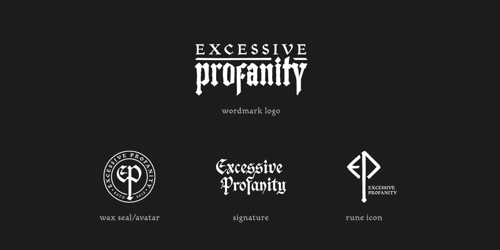


To align with the Victorian Gothic era and the gaming theme, I crafted a new wordmark and supporting iconography. Bloody versions were added per viewer requests.
The 'wax seal' emblem drew inspiration from a popular video game melee weapon, while the runic icon was influenced by Nordic Runes, tying into ‘Bloodborne’; one of the favorite games of this streaming channel.
My deep dive into Victorian Gothic design quickly led me to blackletter script. A script, also known as Gothic script, that was used throughout Western Europe from about 1150 to the 17th century. So, blackletter-inspired lettering seemed appropriate for the most prominent logo parts.
But I also needed a supporting font for the body texts. Something that would smoothly merge the various blackletter elements of the logo, the wax seal and the runic icon. And I found that in the Mezalia typeface.
Mezalia is a family of fonts with shapes influenced by the Bastarda script of the High Middle Ages. But unlike most typefaces with similar origins, Mezalia isn’t just another display blackletter. But a highly legible body text font blending its medieval poise and character with modern sensibilities.
This cohesive design extended to merchandise, enhancing the Excessive Profanity brand on apparel, mugs, and a limited edition vinyl slipmat in their webshop.
"Before we had even begun working together, Gilles had started digging through my video archives for inspiration researching how he might best approach this admittedly unique project. So when work began in earnest it was an effortless relationship on my part. Everything I had envisioned but couldn't verbalise was made manifest in ways I couldn't have ever imagined; the style, theme and essense of what I was trying to achieve was developed and presented in such a way that it not only complimented my ambitions, but inspired them."
— Cody Hargreaves


